Whether you are a beginner or a seasoned landscape designer, landscaping websites are an essential resource. Not only are they a platform for you to showcase your professional skills and creativity to potential clients, but they are also the ideal place to gain inspiration and network with your peers. If you’re seeking a platform that caters to your self-promotion and your need for inspiration and networking, look no further! This article will explore the 8 best landscaping websites, revealing their benefits and unique features to expand your design horizons.
Contents
Top 1. Outdoor Makeover & Living Spaces
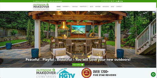
Outdoor Makeover & Living Spaces is a comprehensive website dedicated to outdoor makeovers and living spaces, covering landscaping, hardscapes, decks, porches, roofing, exterior, irrigation, and more. One of its biggest features is providing various real cases for free reference. Not only does this landscaping website offer a vast library of inspiration and design tips, but it also offers an entrance to hire skilled designers from its team directly for professional assistance, making your landscaping vision a reality.
However, it is a pity that this site does not feature online design tools for drafting. For those who want to do landscaping, you will need the help of landscape design software like ZWCAD. Overall, whether you’re seeking inspiration, information, or expert assistance for landscaping, Outdoor Makeover & Living Space is worth your attention.
Top 2. SF Landscape
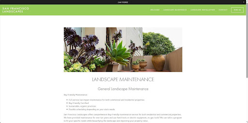
SF Landscape’s website embraces a refreshing green theme. Its homepage features a seamless scroll of beautiful case photos alongside its core business proposition to captivate potential customers while delivering eco-friendly values. Moreover, this landscaping website also displays past projects and design concepts clearly and intuitively, showcasing its professionalism and commitment to sustainability while allowing beginner landscape enthusiasts to learn the basics of the design process. Furthermore, this website avoids information overload. The navigation bar only features essential links, guiding visitors to the information they need quickly and efficiently, even based solely on the website title.
Top 3. Garden Builders
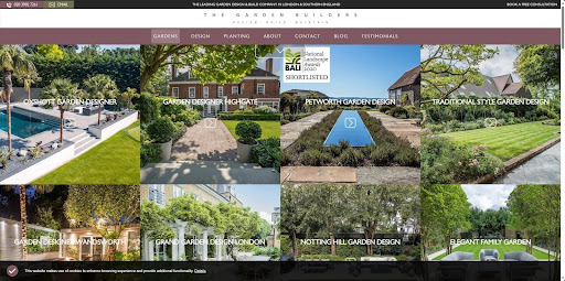
If you’re looking for information on garden design, the official website of Garden Builders is a great resource. You can find garden design inspiration, construction guides, maintenance tips, and even cost-estimating tips for design and construction. This landscape website has a user-friendly interface with a clear navigation bar that makes finding information easier. Moreover, it doesn’t overload you with information or provide a detailed gallery of past projects like other websites. Instead, they use images on every page to showcase their work and provide a jump point for clients to understand their design style and professional abilities easily. Meanwhile, this site offers a contact entrance in a prominent position, making it convenient for customers to get in touch on time.
Top 4. De Leon Landscapes Co.
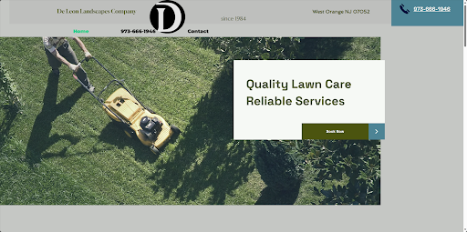
Compared to other landscape websites, De Leon Landscapes Co. has a very simple design and limited information. You can only find basic information about the company and its services, including landscaping, lawn care, mulching beds, and more. However, it has set up many “Book Now” entrances for clients to get in touch in real-time.
However, this website design is only suitable for mature and well-known companies as they have built a good reputation over time, and customers already trust them. As a result, they do not need to showcase their professional strength to have a continuous source of customers. Then, at this stage, the primary task of this website is to ensure that customers can easily find the entry point for ordering and contacting. If you are new to the landscaping industry, it is recommended that you refer to other websites for inspiration and ideas.
Top 5. Cutters Landscaping
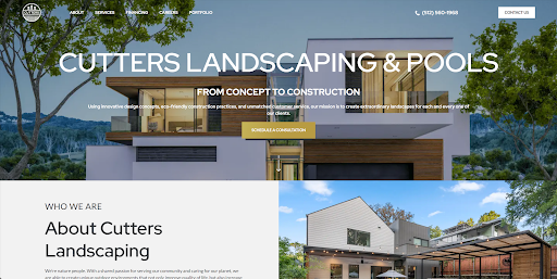
Cutters Landscaping, specializing in residential and commercial landscaping, uses eye-catching visuals and clear language on its website to engage visitors and convey its message effectively. One of the significant benefits of their website is that it showcases before-and-after pictures from past projects, demonstrating the company’s expertise in landscaping. Moreover, the website boasts an organized layout with a user-friendly navigation bar that stays visible throughout the scroll to ensure easy access to information. Furthermore, Clutter Landscaping offers a transparent pricing page to empower users to adjust design budgets promptly. By combining these features, Cutters Landscaping’s website effectively informs, engages, and converts potential clients.
Top 6. GMC Landscapes
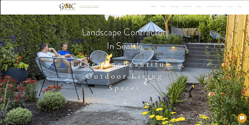
Another great landscape website in this list is GMC Landscapes from Seattle. It features a user-friendly interface with clear layouts, intuitive navigation, easy-to-find menus, and a high-quality image gallery to showcase the post works. The top menu bar provides easy access to all important sections, while it provides a quick contact button in the lower left corner of the page. In comparison, a convenient quick contact button in the lower left corner lets you chat directly with a designer.
Compared to other landscape websites, GMC Landscapes adopts a modern and elegant font that enhances its stylish look. However, the text content and information layout may be somewhat compact, which is not conducive for visitors to capture key information quickly. Overall, GMC Landscapes provides a valuable resource for anyone seeking detailed information about their landscaping services and portfolio.
Top 7. Mulkern Landscaping
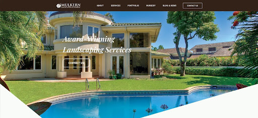
Mulkern Landscaping, an impressive landscape website from Hawaii, leverages a striking fullscreen background image on its homepage. This captivating visual instantly showcases the company’s expertise, giving users a clear insight into their services, like landscape installations and renovations, without needing to read a word. Moreover, its clean and modern style utilizes plenty of white space, allowing minimal text to stand out and be easily captured by visitors. To top it off, Mulkern Landscaping offers a comprehensive list of contact details, including a phone number, email address, and a convenient contact form. This makes it easy for potential clients to reach out. Overall, Mulkern Landscaping’s website design is impressively effective, seamlessly catering to user expectations and conveying the company’s information with captivating visuals and clear communication.
Top 8. Green Options
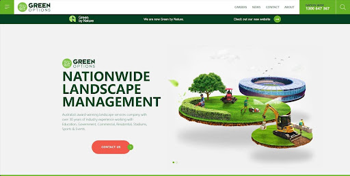
Green Options is a highly acclaimed landscape management company that enjoys a strong reputation in the Australian landscape industry. Its official website features a predominantly green color scheme that perfectly aligns with the company’s name and business content. Moreover, its homepage layout is well-structured and thoughtfully designed. It starts by showcasing the company’s accolades and design concepts at the top to catch the user’s attention. Then, it utilizes a combination of images and text in the middle to highlight the company’s primary services, making a lasting impression on the user. Finally, it displays a portfolio of exceptional projects at the bottom to further enhance customer trust. Overall, Green Options’ website design reflects the company’s professional image and reputation. However, the website is less dynamic and interactive than other websites.
Conclusion
Here is the end of the top 8 landscape websites mentioned in this article. Whether you’re a beginner or a professional landscape designer, these websites are valuable resources that can help you gain inspiration, expand your creative horizons, and learn new skills to create beautiful and functional outdoor landscapes. If you’re interested in interior design, you can explore a variety of interior design websites and learn interior design software to enhance your skills. Lastly, if you find this article helpful, please share it with others so that they can also benefit from it.


